 Simply beautiful designs from Walt Disney World's first decade.
 Well, let me rephrase that. Simply beautiful designs inspired by Walt Disney World's first decade.
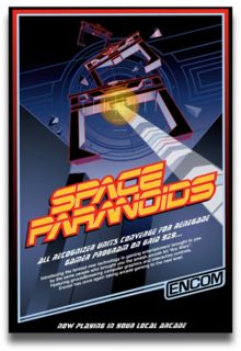
The fact that many folks, upon viewing these wonderful attraction posters for the first time and assume they are authentic objects of bygone days, is testament to the talent and skills of artist and graphic designer Greg Maletic. Greg created the posters as a means of teaching himself how to use Adobe Illustrator, skills he needed for another project he was working on. In a true "dreams come true" bit of synergy, Greg was contacted by a Disney executive who had discovered the posters online, and was commissioned to do actual design work for the House of Mouse!
Greg has generously allowed me to reprint the posters here, and has graciously made them available to anyone who wishes to make printed copies of their own. Check out Greg's blog for all the details. And while there, check out Greg's archive of material he has written for LaughingPlace.com. These well written, insightful articles are well worth your time and interest.




2 comments:
Outstanding designs! I love the style, graphics and colors...very nice!
Thanks for sharing these.
Maybe one day, Disney will notice how fanatical I am about their theme parks and give me a lifetime pass!
Or make me head of their archives. That would be amazing!
Post a Comment